Tuesday, 5 January 2010

silent walking


I have always been fascinated in the way our perceptions change, and what influences that change. Usually more days then not.... I walk around our local field as we have two dogs. Im quite lucky as my garden backs onto a field. I usually work walk the same route each day which takes about 30 mins. It became intriguing to see what changes each day. There are to schools very close to the field so you do get a lot of youth on it. I began to record various changes on my route each day. This contained the movement of object that had been dumped for example an old mattress and a broken lawn mower. The mattress was interesting to record as it left behind marks of dry, worn, bald patches of grass. So you able to trace its exact last place.


Iv also recorded all the different noises which I could hear when I was walking. I feel like there is almost never a silence because there is always something going on around us. 


I then developed this idea and compared the different noises I could hear in the city. I experimented by recording a 20 minute walk into Manchester using a Dictaphone.


I have come across Michel De Certeau, The practise of everyday life (walking in the city).
I did find this hard to read but managed to find some useful quotes.


"The act of walking is to the urban system what the speech act is to language or to the statements uttered".


"First, if it is true that a spatial order organozes an ensemble of possibilities (e.g by a place in which one can move) and interdictions (e.g. by a wall that prevents one from going further)      then the walker actualizes some of these possibilities. In that way, he makes them exist as well as emerge"


Silence

hmmmmm what are my responces to silence.......


NON VERBAL COMMUNICATION
body movement
physical contact
pushing
eyecontact
personal space
gestures
embracing
touching
holding
facial expresions
posture


all of the above convey messages and reflect an element of intimacy or a feeling (or lack of) attraction. The exchange of messages primarily through non linguistic means, including body language, facial expressions and eye contact, tactile communication, space territory, environment and use of silence and time.


I believe silence is 'filling air time'.


Allowing silence in a conversation puts pressure on the other person. Silence can indicate hostility, and facial expressions during silence can indicate disagreement.


Rachel Whitread


This cast house by Rachel Whitread is a great example of capturing something that no longer exist.


ROAD TRIP


Throughout the summer of 2009 I took a road trip starting from San Francisco and ending in Las Vegas . We drove through route 50 which is known as the 'loneliest highway' in the world. This was a long drive...literally through the dessert miles away from anywhere. So this is a great example of silence.


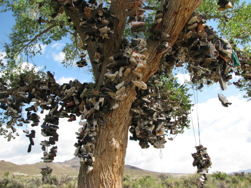
We came across this tree filled with hundreds of trainers. It was like some kind of unique landmark.


Whilst in San Francisco we visited Alcatraz. This is also silence to me because of its isolation from the outside by the cold, strong, hazardous currents of the waters of San Francisco's Bay.


Iv also visited Auschwitz in Krakow in summer 2008.
This place is breath taking in terms of sadness and loss, which again relates back to silence.


Dont Panic


My chosen competition brief was the D&AD Don't panic one. The brief was to create an image for Dont Panic that captures the theme of the Resistance.
Resistance is about going against the grain. Going left when everyone is going right. Resistance is radical for the short term, and revolutionary in the long.  The brief asks us to capture on paper the resistance to the politics of existence. The politics of existence is awareness of the identity of particular aspects of reality. We are also asked to consider sub-aspects of resistance - protection and armour (both physical and mental) aspects of survival, hardiness and determination.


I wanted to focus on making people raise there voice and encourage people to make a difference. 


brainstorm of my thoughts:


initial idea's:


I started to think about the way you feel when you make a difference.

  • excited
  • rewarded
  • happy
  • proud
  • confident
  • motivated
  • pleasure
  • satisfaction
  • dignity
  • heart warming
  • memorable
  • independent
  • worthy
  • fulfilling
  • worthwhile
  • enriching
  • beneficial
  • productive
  • positive
  • assured


I then began to think of ways which i could display the words in interesting ways.
I experimented by placing the words on balloons.


I also had the the idea of people carrying a different balloon each with a feeling on in picture of a busy city street.

Here I wrote the feelings on my friends chest:


Then I added the caption....'you can feel like this on the inside too'.


I really like this idea, but it need developing as it looks to much like Stefan Sagmiester poster for AIG, where he asked an assistant to carve details onto his body and photographed the result. I think i run with this idea abit more by maybe experimenting with other parts of the body instead of using the torso, such as the legs or arms.

DONT PAY LIP SERVICE
What is lip service?........to express respect for something event hough it is the opposite of what one wants. To express loyalty or support for something insincerely (if you dont really care about politics, your just paying lip service to the candidate). Also to say that you agree with and support an idea or plan but not do anything to help succeed.

'DONT SIT HERE AND PAY LIP SERVICE.... GET BUSY'

Here are a few designs for this idea:


Development:

I really like these two phrases:
'your voive has the power'
'your voice could save lives'

I thought of ways which I could illustrate the phrase 'your voice could save lives', and the idea of using a blood bag popped into my head.

I placed the text ontop of an image of a blood bag and it looked bland so
I experimented at linking the text together on illustrator. I felt abit limited as my illustrator skills are abit poor..... but i gave it a bash and im happy with the results.


Monday, 4 January 2010

Craig Oldham

A lovely Yorkshire lad who was currently working at the Chase in Manchester came to give us a lecture. Well to say the least Craig was one of the most entertaining visiting lectures I think we have had so far. Maybe it was because he's our age group..... or because he was brutally honest. He through alot of humour and wit into his lecture, which gave us all a laugh and defiantly held our attention.

He told us all about the industry we are all about enter in literally the next 15 weeks. He gave us an account of the 12 things that he had learned in his first 12 months of being a designer. (He gave us all a pamphlet  called 12 in 12, which was basically a sum up of the lecture). Things that he felt you could only learn through an active participation in the industry.

I found his lecture really helpful and really motivated me and helped me build a positive attitude for when i leave uni and go out into the real world.


He showed us some of his personal work and projects that he has worked on at the chase.


moving on up
A moving card for Manchester Evening News


I also found this project they had worked on when I checked out his website.....I love it. 
olympik
The Olympic Games and Graphic Design


The chase were invited by Grafik to design a poster celebrating an Olympic sport for an exhibition. They was givin the sport BMX to work with.


"BMX is a spontaneous experience. A decision, a move, a technique, and a skill, performed in an instant based on the raw feeling of the rider at that very point in time. It cannot be captured with an image, or with words; it is an experience. Our posters—a celebration of BMX—were created by using just that: experience".


Here's the making.......


Here are some quotes by Craig Oldham that I just had to write down..........

"Its a people business, so be a people person"


"let your life inspire your design"


"why are two heads better than one?...... Because they fucking are, thats why."


"Do not read me  because ill before the shit out of you"


"If you don't fall your not trying"


Johnny Hardstaff

Johnny Hardstaff is a director and designer.  He has directed and designed innovative moving image work across a broad spectrum of both commercial and non-commercial strands of the visual arts. Some of his clients include Sony, Radiohead, Orange, Toshiba, Sony PlayStation and the BBC amongst others. 
On the 6th of October he came to give us a lecture where he showed us some of his work. Below you ban see some of his sketchbooks from 1990-92 ( doodled a monster body of work).


He also showed us some of his motion graphics and commercials. One of my favourite pieces was one of the Orange adverts 'orange paint'. Check it out.....
 I think the advert is very safe and intended. The message of all the paint over flowing is out of the vessels, is saying that Orange give you so much that you cant contain it.
( very much about corporate manipulation )

He told us that Sony hated this piece......but they put it places. "Sony loved it but they just couldn't say it".

I also really liked his Radiohead video 'spinning plates' http://www.youtube.com/watch?v=3qZbMNo-NWI
I love the complex graphics of the machinery and diagrams. The visuls are impressive and work really well with the track. The siamese twins in the video draw attention....... and almost make you feel uncomfortable.


Sunday, 6 December 2009

Resistance


I have chosen to do the D&AD dont panic competition brief. 'Create an image for don''t panic that captures the theme of resistance'. The brief is asking me to capture on paper resistance to the politics of existence.

Politics of existence is awareness of the identity of particular aspects of reality.

research

I really like this advertising campaign by Tria (colour shouldn't matter). I love that it is not a poster and that it becomes interactive with the viewer.

racial-discrimination.jpg


This is an image i came across for discrimination. It appears cliché, but i think its a simple and effective idea that gets the message across.


I think these advertisements for FARM 'don't eat meat' are really effective, they grabbed, but more importantly held my attention. They are designed by Sandra Scher. I think its the harsh imagery which some people might find hard to bear that really garbed me. I don't like the imagery of the dead animals but I like how they have replaced a dinner plate, and how the cutlery is arranged in a place setting to amplify the consequences of ones choice.


victory poster by Fang Chen.
"The capitalised V represented by the two fingers is a universal symbol for victory and is understood by viewers of all races and cultures". The missing fingers also speak to the reality that human beings often experience suffering in order to achieve triumph.


Saturday, 5 December 2009

Helen Murgatroyd


I really like Helens work, I was familiar with some of her pieces from when i met her in my first year at uni. Helen told us about her first final year on Design and Art Direction and showed us some interesting work she had produced.

<span class=


These are some maps she had produced which was part of an investigation, recording the human movement. They are screen prints created from original drawings where she traced the movement of someone in the kitchen whilst they prepared food.


She made various maps for different meals, I love how she has presented the posters in the tubes above. They look wonderful and very intriguing .


Helen had a gap year when she finished her third year because she was unsure what she wanted to do, she did apply for an MA at the Royal College of Arts. I was inspired by her decision not to give up. She decided to become a post lady so she could deliver post in the morning whilst earning money and then use the rest of the day to produce work.

I found this comforting to hear as I am sure im not the only one who is not quite sure which road to take when finishing my degree.


After her gap year she re-applied for the MA of printmaking and got a place.


One of the main things I liked about Helen was that she was interested in the in the process of making design rather then the final outcome itself.


Here are some more pieces of her work which I really like.


Hand made powerpoint presentation......based on the topic of hand made design.