Sunday 6 December 2009

Resistance


I have chosen to do the D&AD dont panic competition brief. 'Create an image for don''t panic that captures the theme of resistance'. The brief is asking me to capture on paper resistance to the politics of existence.

Politics of existence is awareness of the identity of particular aspects of reality.

research

I really like this advertising campaign by Tria (colour shouldn't matter). I love that it is not a poster and that it becomes interactive with the viewer.

racial-discrimination.jpg


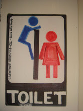
This is an image i came across for discrimination. It appears cliché, but i think its a simple and effective idea that gets the message across.


I think these advertisements for FARM 'don't eat meat' are really effective, they grabbed, but more importantly held my attention. They are designed by Sandra Scher. I think its the harsh imagery which some people might find hard to bear that really garbed me. I don't like the imagery of the dead animals but I like how they have replaced a dinner plate, and how the cutlery is arranged in a place setting to amplify the consequences of ones choice.


victory poster by Fang Chen.
"The capitalised V represented by the two fingers is a universal symbol for victory and is understood by viewers of all races and cultures". The missing fingers also speak to the reality that human beings often experience suffering in order to achieve triumph.


Saturday 5 December 2009

Helen Murgatroyd


I really like Helens work, I was familiar with some of her pieces from when i met her in my first year at uni. Helen told us about her first final year on Design and Art Direction and showed us some interesting work she had produced.

<span class=


These are some maps she had produced which was part of an investigation, recording the human movement. They are screen prints created from original drawings where she traced the movement of someone in the kitchen whilst they prepared food.


She made various maps for different meals, I love how she has presented the posters in the tubes above. They look wonderful and very intriguing .


Helen had a gap year when she finished her third year because she was unsure what she wanted to do, she did apply for an MA at the Royal College of Arts. I was inspired by her decision not to give up. She decided to become a post lady so she could deliver post in the morning whilst earning money and then use the rest of the day to produce work.

I found this comforting to hear as I am sure im not the only one who is not quite sure which road to take when finishing my degree.


After her gap year she re-applied for the MA of printmaking and got a place.


One of the main things I liked about Helen was that she was interested in the in the process of making design rather then the final outcome itself.


Here are some more pieces of her work which I really like.


Hand made powerpoint presentation......based on the topic of hand made design.